Data Visualization

Alice McGrath | 11 June 2024
Overview
- Principles and approaches to data
- What makes a good data visualization?
- The process of visualization
- Activity: RawGraphs.io
- Activity: Draw your data
- Examine power
- Challenge power
- Elevate emotion & embodiment
- Rethink binaries and hierarchies
- Embrace pluralism
- Consider context
- Make labor visible
Data Feminism, D’Ignazio, C., & Klein, L. (MIT UP:
2020). Read for free
online.
What makes a good data viz?
- What’s the message of the visualization?
- What questions does it raise?
- What makes it effective?
![Data viz with red and blue stripes]() Ed Hawkins,
University of Reading, 2018
Ed Hawkins,
University of Reading, 2018
How do you make a data viz?
Get data
- Collect it
- Find a dataset
- Clean and organize it
- Get to know the context and effects of the data collection
process
- Basic info: try using wtf csv
Analyze data
- What types of data do you have?
- How many variables do you have? How do your variables relate to each
other?
- What questions can your dataset answer? What stories can it
tell?
What types of data do you
have?
Numeric | categoric | geographic | temporal |relationships
How
many variables do you have? How do your variables relate to each
other?
quantities/distribution | correlation | part of a whole | change over
time | connections
What questions can you
answer?
What stories can you tell?
Design visualizations
What will you show?
- All variables? Relationships between variables?
- Summaries? Every data point?
What graph types would
be most effective?
- Useful resource: From Data to
Viz
- Use your imagination! Draw your visualization on paper.
- For inspiration: Dear
Data project, Georgia Lupi & Stefanie Posavec; See also the
winners of the [Information is Beautiful Awards]
Communication
- What methods can you use to highlight your variables?
- How can you make the results visually compelling and engaging?
- How can you make them more accessible?
Storytelling
- What should viewers take away from your visualization?
- What kind of contextual information is needed for them to understand
it?
Activity: collecting and
drawing data
Collecting
- How many countries and states have you lived in? For how long?
- List all the locations, with the approximate number of years you
have lived there
- Add your name, each location, and the number of years to the excel
spreadsheet for this workshop: dataviz-workshop-locations-6-11-24.xlsx
Drawing
- In groups of 2: draw visual representations of this dataset
- Design it however you like
- Aim to create two different versions
Activity: visualizing
data with RawGraphs
Creating a data visualization using RawGraphs.io
- Choose one of the data samples and select a recommended
visualization
- Assign categories and data columns to features
- Select colors and labels to customize your data viz
- Export it as an .svg file
Next steps
- Open the .svg in Illustrator for additional customization
- Find your own dataset to visualize in rawgraphs
- Embed your visualization in your log
 Data
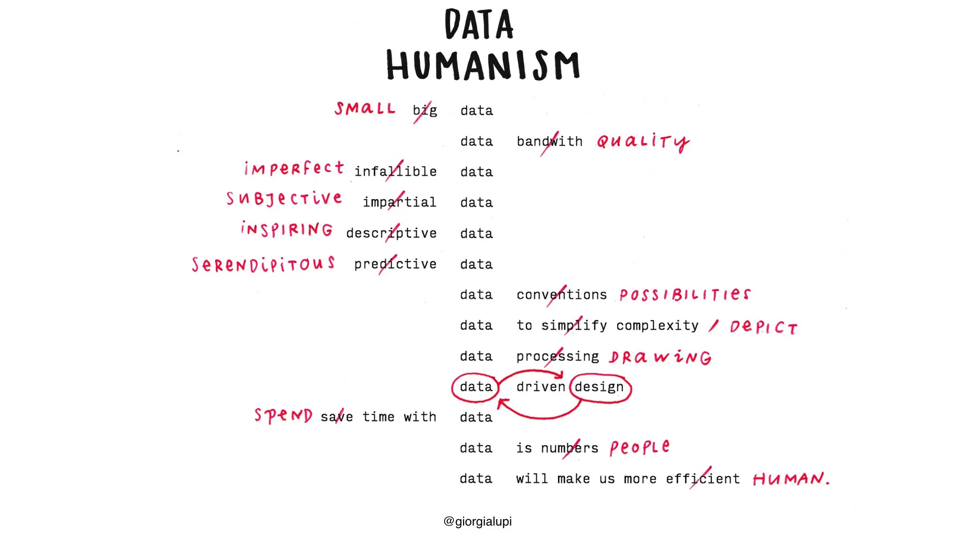
Humanism, a visual manifesto, by Giorgia Lupi
Data
Humanism, a visual manifesto, by Giorgia Lupi
 Matt Korostoff (2021). Read
about it on github: MKorostoff/1-pixel-wealth
Matt Korostoff (2021). Read
about it on github: MKorostoff/1-pixel-wealth
